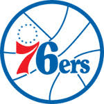
excellent move by the sixers. excellent move. they are returning to their classic (read: best) color scheme and logo. why pat croce thought black and gold was a good color scheme for the 76ers is beyond all rational thought. ok, pat, you like pirates, but the 76ers are not a band of pirates. they represent the city of philadelphia and the birth of the united states. the colors of the united states are red, white, and blue. even this philadelphia union got the memo, but croce wanted black and gold, so black and gold we got. even the ugly-ass uniforms worn in the mid-90s (pictured below) kept the team's traditional colors, even if the design was perhaps the ugliest thing this side of, well, the cleveland cavaliers had some pretty ugly jerseys around that time period as well, but the cavs are the cavs.
 there is a great history of the sixers' uniforms the team's website. it really is amazing how radical the design the croce jersey is when compared to the rest of team's uniforms. now just get rid of that stupid rabbit and we will be all set. oh, and a winning team. that would be nice too.

No comments:
Post a Comment